An Adaptive Web Design or a Responsive Web Design? This a question worth considering given the importance and challenges of offering a great user experience. For developers, the vast diversity of screen sizes amongst smartphones, tablets, and desktops makes it rather difficult to build websites that adjust perfectly across millions of screens.
As a result, many organizations have adopted an Adaptive Web Design or a Responsive Web Design to offer websites that can adjust and respond to a variety of different environments and configurations. Below, we highlight the differences between these two approaches as well as their benefits and drawbacks.
The Impact of Adaptive Web Design
An adaptative design is an approach to web development where developers create multiple layouts of the same site to fit to specific screen dimensions. An adaptive site will first detect the dimensions of the user’s screen and, based on the available layouts created, will choose the one that is most appropriate. The layout of an adaptive site is not influenced by the size of the browser, but rather the size of the screen.
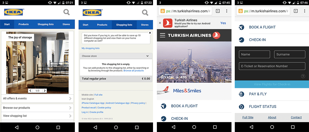
A number of brands and organizations have embraced adaptive design in order to offer sites that are more mobile-oriented. For example, Apple, Amazon, Home Depot, Adidas, Ikea, Turkish Airlines, and USA Today all employ adaptive sites.
Benefits of Adaptive Web Design
Since adaptive designs require developers to create layouts that work specifically with certain screen dimensions, one may argue that adaptive sites offer a better user experience (UX). Creating a unique layout for your iPhone 8 users, for example, can signal to them that you care about their experience when they browse your site on their smartphone.
In general, it is a good practice to create six layouts. However, this can be increased or decreased based on the devices or screen sizes used by your customers or users.
Furthermore, adaptive design is well suited for sites that use advertisements to generate revenue. Developers can optimize each layout to properly include advertisements to ensure they will be seen.
Drawbacks of an Adaptive Web Design
First, an adaptive design requires a large amount of work to create multiple layouts of the same page. Given the heavier workload that is required when choosing an adaptive design, the costs associated with building an adaptive design are higher than those for a typical responsive design. Many developers, therefore, may opt to use adaptive designs to retrofit the existing site allowing them to be used across several screen sizes.
Second, an adaptive design can sometimes fail to consider users when layouts are not optimized to fit a less popular or mainstream screen sizes. For example, an adaptive site may not have layouts specifically designed for tablets or netbooks.
It is also worth noting that the launch of new devices with unique screen configurations will also require developers to create new layouts. This is what happened when Apple launched the iPhone X, which posed several problems for apps and sites that we were not design for this new environment.
Discover the case study: The impact of the iPhone X
Third, SEO scores can differ between the mobile and desktop versions of an adaptive site. Even though the content is identical, some search engines assess SEO on the desktop version of a site differently from its mobile version. As a result, this can negatively affect SEO and thus the performance and ROI of the site.
The Impact of Responsive Web Design
A responsive website is a site that automatically adjusts the layout of the page based on the size of the browser, not the size of the screen. As the size of the browser is changed, the site rearranges the content and layout accordingly in order to provide the user with an optimal layout.
Benefits of Responsive Web Design
First, a responsive web design is easier and requires less labor to implement. Since developers only have to create one layout, as opposed to multiple layouts when building an adaptive design.
Second, a responsive design provides users with a consistent and seamless experience across multiple screens or devices. This translates to a better user experience for all users, which is key in today’s retail industry.
According to Google, 85% of online shoppers start a purchase on one device and finish it using another. This makes it quite important for retailers to provide a great and consistent e-commerce experience across multiple devices.
Third, responsive designs are search engine friendly especially when it comes the indexation of mobile sites. This is key when considering the fact that Google will primarily index and rank sites based on their mobile version as opposed to the desktop version. As a result, SEO scores can be more favorable for a responsive design.
Drawbacks of Responsive Web Design
First, using a responsive design gives developers less control over how the site is arranged according to the available space in a browser. Developers must consequently remain be prudent ensuring the design of the website will work well across a variety of screens.
A second drawback of a responsive design is the fact advertisements can be lost when the sites are rearranged for smartphones. Ads that do not appear on the screen or are pushed to the bottom on the page can reduce potential earnings.
Third, sites may load slower on mobile devices when compared to desktops due to the size of images on the site. Desktop-oriented sites, even if responsive, can experience this problem due to the presence of large photo files.
Mobile page load times are extremely vital to the success of a website. According to Google, 53% smartphone users are likely to quit a mobile site that takes longer than 3 seconds to load.
Research by Google also confirms hat many mobile sites are still too slow. The average mobile load time is 15 seconds, more than 5 times slower than Google’s recommended page load time.
Designing Separate Mobile and Desktop Sites?
Can’t developers just build an additional version of their website dedicated to serving mobile devices? The answer here is yes. However, there are several drawbacks to this approach. Obliviously, building two sites requires a lot of work. Also, mobile sites will still have to contend with the vast diversity of screen sizes that exists today.
Having a separate mobile and desktop site can lead to a greater workload. The work required to maintain both sites and keep them in sync with one another can be extremely taxing. This approach can too lead to a less efficient use of resources when compared to responsive and adaptive sites.
QA Tests for Responsive Designs & Adaptive Designs
Regardless of the approach website developers choose, it is crucial to keep in mind that the performance of any site will largely be tied to the quality of its content as well as the quality of its user experience and functions.
Therefore, quality assurance (QA) test campaigns are a vital to uncovering bugs or anomalies that taint the user experience, functions, and more. To learn more about the importance of testing, please do not hesitate to check out our latest white paper: The digital trends and challenges within the retail sector.


Ask for a quote
Other Publications that might interest you